What gets you Twitter followers? Part 3 of 3: content

Here’s the final part of my short series on mining data on around 50,000 Twitter accounts, as recorded by Twanalyst. Previously:

  • Part one looked at user profiles. Generally, the more you fill out your profile (description, avatar, background image etc), there seems to be a correlation with increased number of followers; and high-status description terms (‘entrepreneur’, ‘author’, ‘speaker’ etc) perform better than, er, low status ones (‘student’, ‘nerd’ etc).
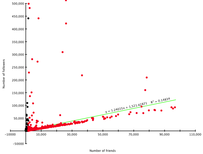
  • Part two discussed friends counts, and frequency of tweeting. There is an unsurprisingly close correlation between the number of friends you have and the number of followers; and you’re better off tweeting less than 30 times a day to avoid putting off followers. (Remembering always that correlation doesn’t mean causation, fact fans!)

Twanalyst also records data on the ‘type’ of tweets people write. It divides them into five categories:

  • Replies/mentions – anything beginning with a @ goes into this pot (mean 35% median 34%)
  • Retweets – ie simply retweeting others’ content (with RT as the flag) (mean 5% median 1%)
  • Links – tweets that contain web links pointing elsewhere (mean 16% median 9%)
  • Hashtags – tweets that use a hashtag to participate in some group activity (mean 3% median 0%)
  • Everything else – ie just normal tweets that aren’t any of the above (what people had for lunch, random witticisms, or whatever) (mean 41% median 37%)

Obviously in reality these categories aren’t so discrete, but let’s live with that and assume everything falls into one or another. Twanalyst records each as a percentage of total tweeting output (it analyses the most recent 200 tweets).

Expressed as a graph of these percentages against average follower counts for each percentage point (I’ve chopped off a few extreme values due to accounts with hundreds of thousands of followers):
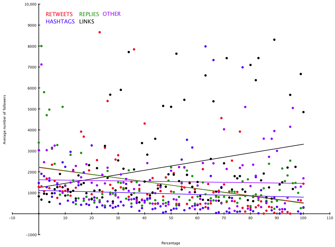
Tweet content/followers

The ‘lines of best fit’ are not hugely precise, but in broadly speaking it seems that there is a slight correlation between tweeting links and higher follower counts – people are interested in accounts which gather interesting stuff from elsewhere and tweet about it. The other values don’t really have any strong correlations.

One final analysis. Twanalyst also calculates a user’s Automated Readability Index – ie a rough measure of the simplicity or complexity of the language they use. A figure of between 6 and 12 represents ‘normal’ prose: below is simplistic and much above enters the realm of obscurantism. (It should be noted though that because tweets often contain links, odd hashtags and so on, the ARI figure is of necessity a bit vague.) Here’s ARI (chopped off at 50, and ignoring twitter accounts with more than 100,000 followers) measured against average follower counts for each data point:
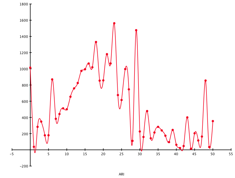
readability

Not much to add here, except the obvious: very simple and very complex writing styles seem to put people off (apart from an odd blip at ARI=48), but a reasonably level of complexity may actually be popular. Or it may all be coincidence. Over and out!
Simple methods get my vote

For the last decade I’ve been following the fascinating work of Gerd Gigerenzer and colleagues (especially Dan Goldstein) – as briefly as I can state it, he has identified a number of very simple heuristics which outperform far more complex models for decision-making processes or making predictions about certain kinds of data (this stuff has partly inspired my Feweristics project). The most accessible explanation of all this is in his book Gut Feelings, where he explains things such as the recognition heuristic, and how it can be used to predict the winner of Wimbledon, or build a stock market portfolio that outperforms many experts, and so on.

Now two researchers, inspired by Goldstein and Gigerenzer’s ‘take-the-best heuristic’ have applied the less-information-beats-more methodology to the US elections since 1972. You can read their paper, Predicting elections from the most important issue facing the country (PDF – I found it via Decision Science News, the work of GG’s collaborator Dan Goldstein), though the bare bones as follows.

In the abstract, authors Andreas Graefe and J Scott Armstrong say that their simple model, called PollyMIP, “correctly predicted the winner of the  popular vote in 97% of all forecasts. For the last six elections, it yielded a higher number of correct  predictions of the election winner than the Iowa Electronic Markets”. Basically, they used a database of pre-election polls to identify what voters thought was the single most important issue each time (this varied over time before the election, in some cases more than others), then used the same database to pull out poll results for which of the two candidates (ie Democrat or Republican) they believed would deal with that issue best (they looked at all polls up to 100 days before the election). In passing, they corroborated other research that the incumbent party always starts with an advantage. (The authors note in their paper: “In the real world, people usually have to make decisions under the constraints of limited information and time, which is why models of rational choice often fail in explaining behaviour.”)

In full, their PollyMIP heuristic works thus (taken verbatim from their appendix):

Step 1 (identifying the most important problem)
Search rule: Look up last available poll on the most important problem facing the country; sort problems in the order of importance.
Stopping rule: Stop search if there is a single most important problem. If two or more problems are of similar importance, average their importance with the results from the most recent previously published poll until a problem is identified as the single most important.

Step 2 (obtaining voter support for candidates on most important problem)
Search rule: Look up polls that obtained voter support on the problem identified in step 1.
Stopping rule: Stop search if there are one or more polls available. Average voter support for each candidate and calculate the two-­party shares of the incumbent. Move to step 3.
If no polls are available and the most important problem (as identified in step 1) is different from the previous day, move to step 2.A. Otherwise move to step 2.B.

2.A (most important problem different to the day before)
Stopping rule: Take the incumbent’s two party share of voter support from the last available poll on the most important problem. Move to step 3.

2.B (most important problem similar to the day before)
Stopping rule: Take the PollyMIP score (see step 3) from the previous day. Move to step 3.

Step 3 (determining election winner)
Decision rule: Average the incumbent’s two-­‐party share of voter support for the last three days, which is referred to as the PollyMIP score. If the PollyMIP score is above 50%, predict the incumbent to win. If it is below 50%, predict the challenger to win. Otherwise, predict a tie.

Or, more briefly: “(1) Identify the  problem seen as most important by voters, (2) calculate the two-­party shares of voter support for the  candidates on this problem and average them for the last three days, and (3) predict the candidate with the higher voter support to win the popular vote.

Not bad for predicting election results 97% of the time. I’d love to see whether this would work for Britain’s elections, too. (They used the iPOLL databank – anyone know if there’s an equivalent for the UK?)

What gets you Twitter followers? Part 2: friends and frequencies

I’ve been analysing data from 50000 Twitter accounts, recorded by my Twanalyst tool (tracks your Twitter stats over time, and analyses your tweeting style and personality). In Part 1, I looked at how people’s profiles might correlate with their number of followers, and a few trends emerged.

This time I’ve been looking at the relationship between follower counts and the following:

  • Number of friends
  • Time since joining Twitter
  • Number of tweets written
  • Average number of tweets written per day

In each graph below, the X-axis shows the above data, with follower counts on the Y axis. The Y figures are averages taken for each value of X.

Friends

Friends/followers
Friends/followers

The green line is the estimated line of best fit by OmniGraphSketcher (excellent Mac graphing program) – though it seems slightly generous. (I’ve cut friends off at 100000, as the few data points above that are so high that the rest of the data becomes unclear.) Roughly speaking, and unsurprisingly, there’s a one-to-one relationship between friends and followers. Want followers? Make friends.

Time

Days/followers
Days/followers

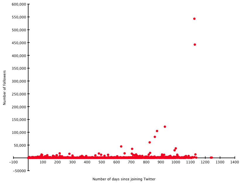
Obviously you need to have been on Twitter for a little time to get followers – but overall there isn’t really any strong correlation noticeable between how long you’ve been using it and how many followers you have. It must be what you do with Twitter that matters, rather than simply Being There.

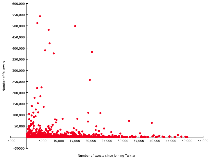
Tweets

Tweets/followers
Tweets/followers

This doesn’t seem to show much, either. What might be helpful is to measure this against time…

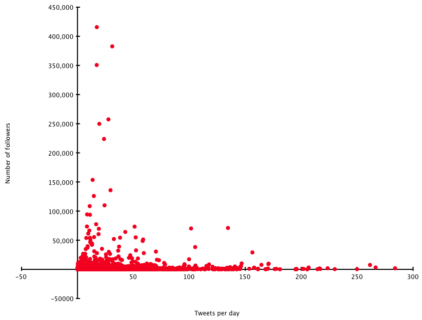
Rate

Tweet rate/followers

When you measure the average number of tweets per day (since joining Twitter, and I’ve ignored a handful of rates over 300/day), a broad message comes across that you’re best of tweeting up to around 30 times a day – above that, and you risk putting people off. Again, this isn’t exactly surprising.

So there aren’t really any profound observations here, sorry: the data seems to corroborate common sense.

In the third and final part of this series, next week, I’ll see if there are any correlations between tweeting style (as recorded by Twanalyst – number of retweets, posting of links, how much you reply to other people etc) and follower counts. Thanks for listening!

PS: I’m indebted to the UNIX BASH Scripting blog for an awk script that helped crunch this data.

What gets you Twitter followers? Part 1: profile usage

Running Twanalyst has given me access to large amounts of data, which I’m slightly-too-addicted to crunching. Inspired by this post at Social Media Today, which analyses the popularity of Twitter users according to the words they use in their tweets, I realised I have a large database of people’s Twitter biographies. Do the words people use in their self-penned descriptions have any influence on the number of people who follow them? (Well, presumably yes, given that ‘sod off and don’t follow me’ would be an ill-advised way of getting a large following.) But which words?

I’ll come back to that – first, some more general data.

I analysed around 50000 accounts with data stored at Twanalyst. The average number of followers was 1449. Some gleanings:

  • 66% of people gave a URL with their Twitter biography – they averaged 1984 followers, whereas those who didn’t give a URL averaged only 429
  • 50% of people use a background picture of some kind – they averaged 2196 followers, whereas those who didn’t use one averaged only 707 (more on the pictures in a moment)
  • 97% of people use an avatar (ie little icon) with their Twitter account – they average 1485 followers, whereas those who don’t average just 144
  • 80% of people provided a biography or description – they averaged 1541 followers, whereas those who didn’t averaged 183.

Of those who use a background picture, by the way, the most popular ones of those provided by Twitter are themes 1,2,5,9 and 10 (all with > 1000 users – 1 has > 10000) – but only theme 15 took the follower count above average, and that’s probably just because the Hollywood actor Neil Patrick Harris (with around 130,000 followers) uses it! (I haven’t mined whether using your own background picture is better than using one provided by Twitter, though the above data implies that.)

Back to the words.

I got rid of stop words, then mined the biographies for words (mostly nouns, plus a few selected adjectives) which describe someone’s role in life (whether career-based, such as ‘programmer’, or personal such as ‘wife’). The top 10 words (by popularity) were: geek, writer, student, developer, lover, father/dad, mother/mom, blogger, photographer and designer. I only looked at words used by 1% of by sample set or more.

The only words in the top 50 or so terms associated with above average follower counts were: blogger (2323 – remember the average was 1449), artist (1692), girl (1711), fan (1712), author (3681), entrepreneur (2663), director (1683), marketer (2541), expert (4273) and singer (2300). Some more details picked out (all figures are average number of followers where the description uses the term in question):

  • The worst terms (all with follower averages below 400) were student, developer, nerd, engineer and programmer – go figure! (Geek came in at 675, so also pretty low.)
  • Home life and gender: father/dad gets 845, but mother/mom gets 1202; girl gets 1711 but boy only 518; husband gets 868, wife 740; oddly the generic guy gets 1380.
  • Expertise: amateur gets 477, expert gets 4273 (but professional only has 969)
  • Although author gets 3681, writer gets only 906 – maybe people see ‘author’ as more established, and writer as more wannabe? (Editor fares averagely with 1409.)
  • Although singer gets 2300, musician only gets 585.

I can’t claim using the right words is a guarantee of a high follower count, of course – that must relate to what you write as well as who you are; but there do seem to be some general trends (eg expertise rates high, and nobody wants to read what students have to say!). Oh, and if you use the phrase follow me in your bio, the average follower count is 2418…

Another time I’ll mine some data about how people’s Twitter behaviour (eg how much they follow others, how often they tweet, what sort of tweets they write…) relates to follower counts too. Watch out for Part 2 some time in the next few weeks. If I find any more time (ha!) I might create a tool where you can look up terms yourself.

(Oh, and you can follow me at @hatmandu, of course!)

Edit (Part 1A!)

Here’s another angle on the same data set. Out of 39975 profiles which include descriptions, we find the following:

  • 1.5% have 10,000 or more followers. The top 10 ‘role-defining’ terms people in this subset use are: blogger (4.6%) author founder speaker writer entrepreneur host father/dad director marketer (2.2%)
  • 10.0% have 1,000 or more followers but less than 10,000. The top 10 terms here are: blogger (7.7%) writer geek father/dad entrepreneur author designer lover mother/mom founder (3.0%)
  • 44.2% have 100 or more followers but less than 1,000. The top 10 terms are: geek (5.7%) writer blogger designer student lover developer father/dad mother/mom photographer (2.7%)
  • 44.3% have less than 100 followers. The top 10 terms are: student (2.7%) geek writer designer developer lover guy fan mother/mom photographer (0.8%).

It’s noticeable that writer appears at all levels – from the hugely successful to the obscure and aspiring, just like in real life. It’s hard not to spot that the very top end accounts are full of founders and speakers etc. And the bottom: those pesky students again. I’m surprised blogger fares so well – but perhaps people like bloggers who write about a specialist subject?

Part II next week!

What’s it all about, Alfie

I’ve just launched a new tool at Hatmandu.net, a text content and keyword analyser – in theory useful for search engine optimisation, but also to get the general gist of a text.From the notes:

This text content and keyword analyser is intended to give a more precise indication of a text’s most important words than other tools available. Most keyword analysers use simple word frequency (which is also shown here anyway), but that doesn’t relate the specific text to the language in general – common terms such as ‘people’ and ‘time’, for example, appear in many documents, but do not necessarily indicate the essence of the particular text being analysed. This analyser uses the TF-IDF statistical method to relate the frequencies of words in the specific text to their general frequencies in the British National Corpus. I am indebted to Adam Kilgarriff‘s version of the BNC, which I have adapted considerably for this tool. This analyser mainly uses the nouns in the BNC, on the basis that these are the parts of speech that best indicate the subject matter of a text. (At some point I hope to produce a version using an American English corpus, though I’d be surprised if the results were very different.)

It works with Twitter accounts (though it only reads the last 200 tweets, which may not form a usefully large body of text), and URLs where my humble scraping tool is able to extract the text successfully – most useful is the ‘paste text’ field, which will accept up to 1Mb of text (about 200,000 words) – so will analyse entire books if desired. Livejournal users can enter their URL (http://username.livejournal.com) assuming their account is public.

It’s a bit experimental at the moment, but hopefully might migrate from ‘possibly fun’ to ‘possibly useful’ in due course!